Japandi Kitchen Decor Ideas: Gray, Yellow, Concrete & Bouclé
Your Kitchen Called, It Wants to Go to a Spa
Picture this: It’s 7:00 AM on a Tuesday. Instead of tripping over a stray dog toy and squinting at a fluorescent light that’s way too aggressive for this hour, you walk into a kitchen that feels like a deep, cleansing breath. The light is hitting your concrete counters just right, and your bare feet are comfortably tucked into a rug that feels like a cloud. You aren’t in a five-star Kyoto resort; you’re in your townhouse, and you haven’t even had caffeine yet. This, my friend, is the magic of japandi kitchen decor ideas gray yellow palettes—it’s where your “I need to get stuff done” energy meets your “I just want to hibernate” soul.
I know what you’re thinking. “My townhouse kitchen is the size of a postage stamp, and it currently looks like a Tupperware explosion.” Believe me, I’ve been there. But here’s the secret: you don’t need a sprawling estate to nail that serene, high-end look. By blending the cozy, “Hygge” vibes of Scandinavia with the sleek, minimal “Wabi-Sabi” aesthetic of Japan, we’re creating a space that feels intentional, not cluttered. We’re talking about mixing cold, industrial concrete with the warm, teddy-bear softness of bouclé. It’s the design equivalent of wearing a silk slip dress with a chunky oversized cardigan.
The real star of the show? The unexpected pop of yellow. No, we aren’t painting the walls like a school bus. We’re talking about “sun-drenched ochre” and “mellow mustard” accents that play off those cool grays. Throw in some chunky knit throws draped over a breakfast stool (yes, in the kitchen!) and suddenly, your morning toast feels like a spiritual experience. It’s warm, it’s functional, and it’s undeniably cool.
If you’ve been scrolling through kitchen design ideas and feeling like everything looks a bit… sterile, this is your sign to mix it up. We’re leaning into 2026 trends that value tactile surfaces over glossy perfection. We want textures you can actually feel. We want a kitchen that looks as good while you’re hosting a wine night as it does when you’re scrolling through home office setup ideas during your lunch break. Ready to turn your “meh” kitchen into a “hell yes” sanctuary?
The Science of “Chill”: Why This Combo Actually Works
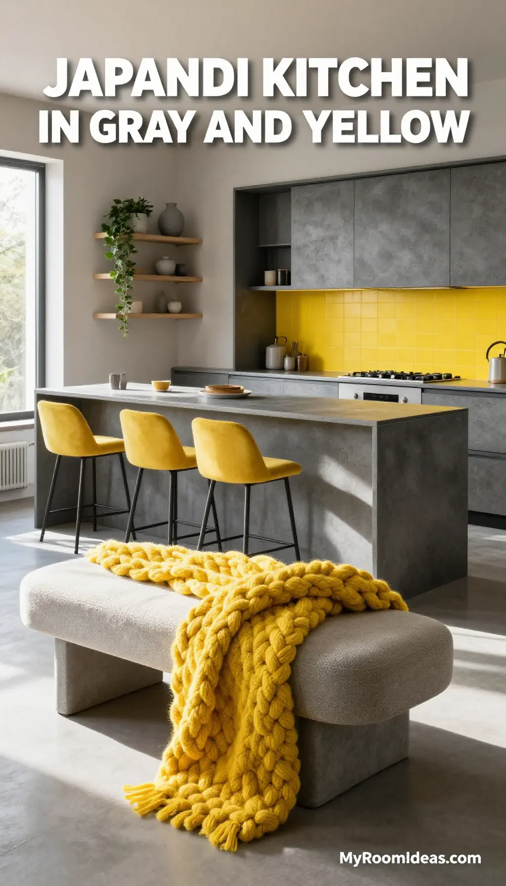
Why are we all suddenly obsessed with Japandi? It’s basically the interior design version of a weighted blanket. In a world that’s constantly shouting at us from our phone screens, our homes need to be the place where the volume gets turned down. By using a gray and yellow palette, we’re balancing two very specific psychological needs. Gray provides the “anchor”—it’s stable, sophisticated, and neutral. But too much gray can feel like a rainy day in a basement. That’s where the yellow kicks in. It’s a shot of dopamine; it mimics sunlight and keeps the energy high enough to actually finish your meal prep.
Then we have the materials. Concrete is the “tough guy” of the design world. It’s raw, it’s durable, and it says, “I have my life together.” But a kitchen full of stone and metal is a bit cold. Enter bouclé and chunky knit throws. These fabrics are the ultimate softeners. They absorb sound (great for those townhouse walls!) and add a layer of luxury that makes your kitchen feels more like a living space. It’s that “lived-in luxe” look that sites like The House Ideas are constantly raving about for 2026.
Think about it: most townhouse kitchens are narrow. Dark colors or heavy wood can make them feel like a hallway. By using light gray concrete and textured white bouclé, we’re bouncing light around and making the walls feel like they’re stepping back. It’s a visual trick that makes a small space feel airy and expensive without you having to knock down a single wall. Plus, yellow accents—like a bowl of lemons or a knit runner—draw the eye to specific focal points, making the room feel organized and curated.
The Color Palette: Not Your Grandma’s Gray
Getting the right shade of gray is like finding the perfect pair of jeans—it’s harder than it looks. You want a gray that feels warm, not like a gloomy sidewalk. For the walls, I’m obsessed with Sherwin-Williams Repose Gray (SW 7015). It’s the ultimate “greige” that plays nice with both the cool concrete and the warm yellow accents. If you want something with a bit more depth for your lower cabinets, try Benjamin Moore Amherst Gray (HC-167). It’s moody, sophisticated, and makes yellow pop like a dream.
The “Sunbeam” Yellows
For the yellow accents, we’re staying away from neon. Think earthy and grounded. Benjamin Moore Hawthorne Yellow (HC-4) is a classic choice that feels like a sun-drenched afternoon. If you’re feeling a bit more adventurous, Sherwin-Williams Mustard Seed (SW 2912) perfectly complements the texture of a chunky knit throw. Here are the Hex codes for your digital mood board:
- Concrete Gray: #A9A9A9
- Mellow Yellow: #F4D03F
- Soft Bouclé White: #F9F7F2
Pro-tip: If you’re nervous about color, use the 80/20 rule. 80% neutrals (grays, whites, concrete) and 20% “wow” (yellow accents and textures). If you only pick one thing to change today? Swap your kitchen towels for a mustard waffle knit. It’s an instant mood lifter.
Design Elements: The High-Low Mix
Creating a Japandi kitchen doesn’t mean you have to clear out your bank account. It’s all about the mix. I love taking IKEA basics and pairing them with one or two “hero” pieces from West Elm or CB2. For example, use the IKEA SEKTION cabinets in a matte gray, but swap the standard hardware for sleek, brushed gold or matte black pulls. It immediately elevates the whole look.
The Furniture & Texture
For seating, look for stools that feature bouclé upholstery. They are surprisingly easy to clean (get a performance fabric!) and add that “spa-retreat” vibe instantly. Target has been hitting it out of the park lately with their Project 62 and Threshold lines—keep an eye out for curved wooden stools that scream Japandi. Over in the corner, place a small wooden bench draped with a chunky knit throw from Amazon. It’s the perfect spot to sit and wait for the coffee to brew.
Lighting: The “Jewelry” of the Room
Lighting should be sculptural. Think oversized paper lanterns (very Japanese) or sleek, dome-shaped pendants in a matte gray finish. Avoid anything too “shabby chic” or overly ornate. We want clean lines. If you have an island, a trio of concrete-effect mini-pendants from West Elm can really anchor the space. For more inspiration on how to carry this vibe throughout your home, check out our living room design ideas.
Step-By-Step: The Weekend Warrior Guide
- The Great Purge (2 Hours): Before you add the pretty stuff, clear the decks. If you haven’t used that avocado slicer since 2019, it’s gotta go. Japandi is about breathing room. Clear your counters completely.
- Concrete “Cheat” (4 Hours): Real concrete slab counters are heavy and pricey. Instead, use a concrete skim coat kit (like Feather Finish) over your existing laminate. It’s a bit messy but totally doable for a DIYer. It gives that raw, edgy look for about $50.
- Paint the Accent (1 Day): Pick one area—maybe the kitchen island or a small accent wall—and go for that soft gray or yellow. Painting lower cabinets gray and keeping uppers white is a classic “townhouse trick” to keep the space feeling open.
- Update the Hardware (1 Hour): This is the easiest win. Replace those generic silver knobs with something tactile. Look for wood or matte black. It’s the “designer secret” that makes IKEA look like custom cabinetry.
- The Bouclé Layer (30 Mins): Bring in your bouclé stools or seat cushions. If you have a breakfast nook, a bouclé bench is a game changer. It adds that “touchable” element that bridges the gap between kitchen and living room.
- The Cozy Factor (15 Mins): This is my favorite part. Grab those chunky knit throws and drape them over the back of a chair or place them in a beautiful seagrass basket near the door. It signals that this kitchen is a place to linger.
- Style the Counter (20 Mins): Less is more. A wooden cutting board, a single ceramic vase with some dried branches, and a beautiful bowl of lemons. Done.
Total time? One very busy weekend. Total impact? You’ll feel like you moved into a new house. Plot twist: you might actually start enjoying doing the dishes.
The Shopping Guide: Get the Look
Under $100:
- Chunky Knit Throw: Amazon or Target ($35 – $60). Look for cotton blends to avoid pilling.
- Amber Glass Soap Dispensers: To keep those concrete counters looking cluttered-free ($20).
- Set of 4 Mustard Linen Napkins: H&M Home ($15).
Mid-Range ($100 – $500):
- Bouclé Counter Stools: Wayfair or West Elm (approx. $180 – $250 each). Look for the “Emery” or “Slope” styles.
- Concrete Pendant Lighting: CB2 ($129 each). Sleek and industrial.
- Jute & Sisal Runner: To add organic texture to the floor ($120).
The Splurge ($500+):
- Smeg Toaster in Slate Gray: Because even your appliances should be aesthetic ($250+).
- Custom Concrete Countertop Installation: If you aren’t a DIY fan, hire a pro ($2,000+).
- Designer Wooden Dining Table: A solid oak piece from Ethnicraft ($1,500+).
Oops, Let’s Avoid These!
- The “Fluff” Overload: We love bouclé, but don’t go overboard. If your kitchen looks like a sheep exploded, you’ve gone too far. Stick to 1-2 upholstered pieces.
- Too Much Yellow: Yellow is like salt; a little enhances everything, too much ruins the dish. Avoid yellow cabinets in a small townhouse—keep it to accents and accessories.
- Ignoring Lighting: Many townhouse kitchens have one sad “boob light” in the center. If you don’t update your lighting, your gray will just look like “shadow.”
- Mismatched Grays: Watch out for undertones! Some grays are blue, some are purple. Stick to the warm, “greige” grays we talked about to keep the vibe cozy. I once painted a wall “Cool Gray” and my kitchen ended up looking like a haunted hospital. Learn from my mistakes!
- Forgetting the “Japan” in Japandi: Don’t forget the minimalist side. If your counters are covered in air fryers and blenders, the bouclé won’t save you. Hide the tech!
Frequently Asked Questions
Is bouclé actually practical for a kitchen?
I get this one a lot! If you have kids or a messy spouse, look for “Performance Bouclé.” It’s treated to resist stains. Also, use it on stools—not near the stove where grease travels. It’s surprisingly resilient if you catch spills early!
How do I make a townhouse kitchen feel bigger?
Use the same floor color as your living room design ideas to create a seamless flow. Also, open shelving (sparingly!) can make the walls feel further back.
What if I rent and can’t change the counters to concrete?
Use large concrete-effect cutting boards or contact paper! There are some incredibly realistic vinyl wraps now that can give you the look without risking your security deposit.
Does yellow go out of style quickly?
The beauty of the japandi kitchen decor ideas gray yellow approach is that yellow is the accent. If you get tired of it in three years, you just swap the throw blanket and the vase. The “bones” (gray and concrete) are timeless.
Can I mix Japandi with other styles?
Absolutely! A little bit of “California Cool” or even some pieces from bathroom decor trends (like matte black fixtures) blend perfectly. Check out The Pink Decor for ideas on how to soften modern looks with color.
Is it weird to have a blanket in the kitchen?
Only if you’re using it as an oven mitt! A chunky knit throw on a bench or stool makes the kitchen feel like a place where people want to hang out and talk to the cook. It’s “kitchen-sitting” culture, and I’m here for it.
You’ve Got This, Designer!
Transforming your kitchen into a Japandi haven is more than just a home project; it’s about creating a space that actually looks after you. There’s something so grounding about running your hand over a cool concrete counter and then settling onto a soft bouclé stool with a cup of tea. It’s about finding beauty in the balance—the hard and the soft, the cool and the warm.
Your townhouse might not be a sprawling mansion, but it has something better: soul. By focusing on japandi kitchen decor ideas gray yellow tones and high-quality textures like chunky knit throws, you’re making every square inch count. You don’t need a massive renovation to feel like you’ve leveled up your life. You just need a vision (and maybe a really good gray paint swatch).
So, what are you waiting for? Grab that mustard-colored vase you saw at Target, clear off those counters, and start creating the sanctuary you deserve. For more home inspo, don’t forget to check out our bedroom inspiration guides to keep the zen vibes flowing throughout the whole house. Now, go forth and Japandi-fy! You’re going to love it here.